A Customer-focused Approach to Redesigning Business Services
Seamless navigation of corporate secretarial services platform
Client
Boardroom Limited
Date
Designed 2021
Service
UX Audit
Information Architecture
User Testing
Participatory Design
Workshop
Wireframe and prototype
Product Design
Challenge
Technically-rigid business service portal experience that was not user-friendly
Outcome
An end-to-end seamless redesign focusing on the customers’ needs
Introduction
BoardRoom Limited has over 50 years of experience in Corporate and Advisory Services in Asia-Pacific. They help many Fortune 500 multinationals, public-listed firms and privately-owned enterprises with business services and expansion. They are experts in navigating complex regulatory policies and cultural sensitivities throughout Asia-Pacific, and have successfully helped 5,500 companies. Their portfolio includes Corporate Secretarial; Share Registry Services; Accounting; Expat Compliance Services; Tax; Employee Share Plan Administration; Regional Payroll Solutions; and Human Resources.
UXStudio was brought in to redesign their corporate secretarial services platform. Initially designed by their in-house engineers, BoardRoom realised that their platform needed to be more user-friendly.

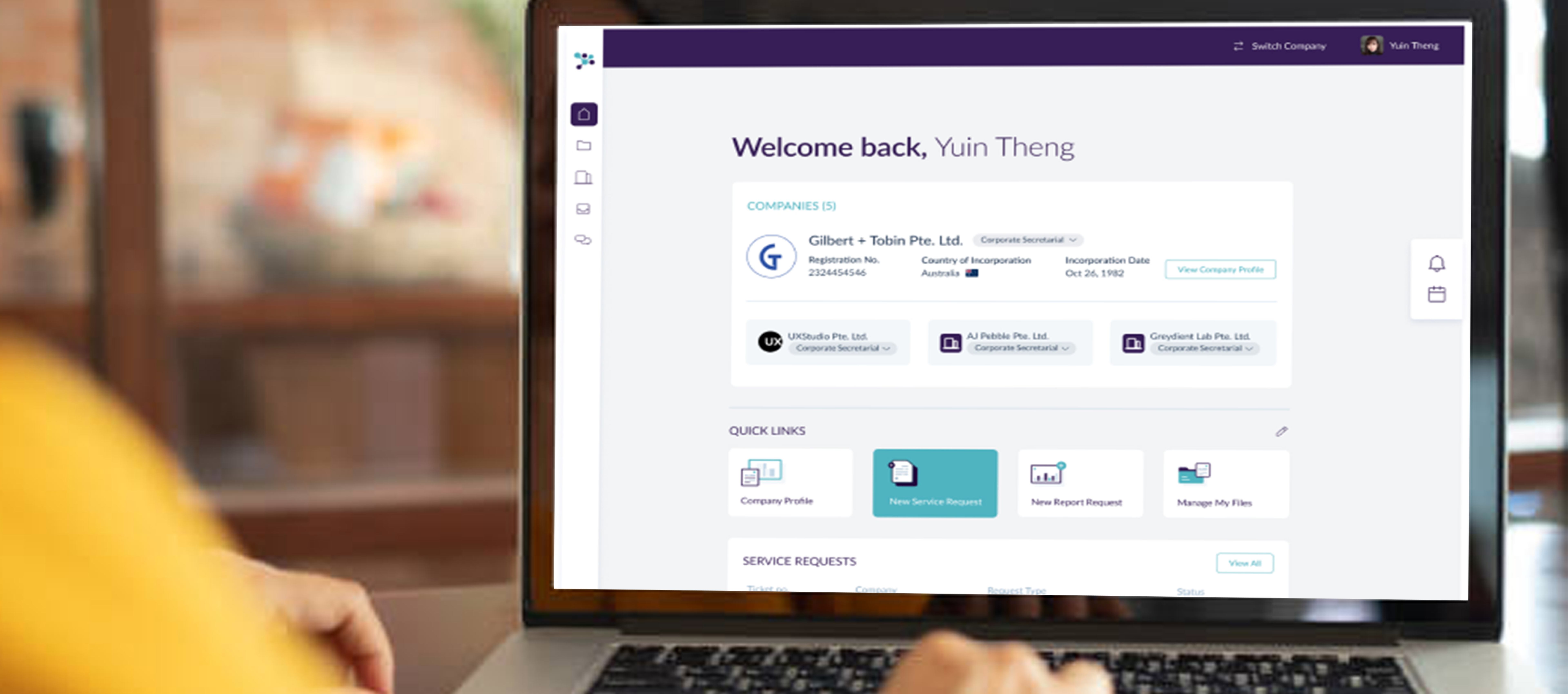
Finalised CS Connect Design
Design Strategy
We tackled the redesign using the design thinking process with stronger emphasis on illumination on existing issues (discovery phase), defining the art direction of the platform, building empathy with the customers of the platform and ideation of the dashboard redesign features.
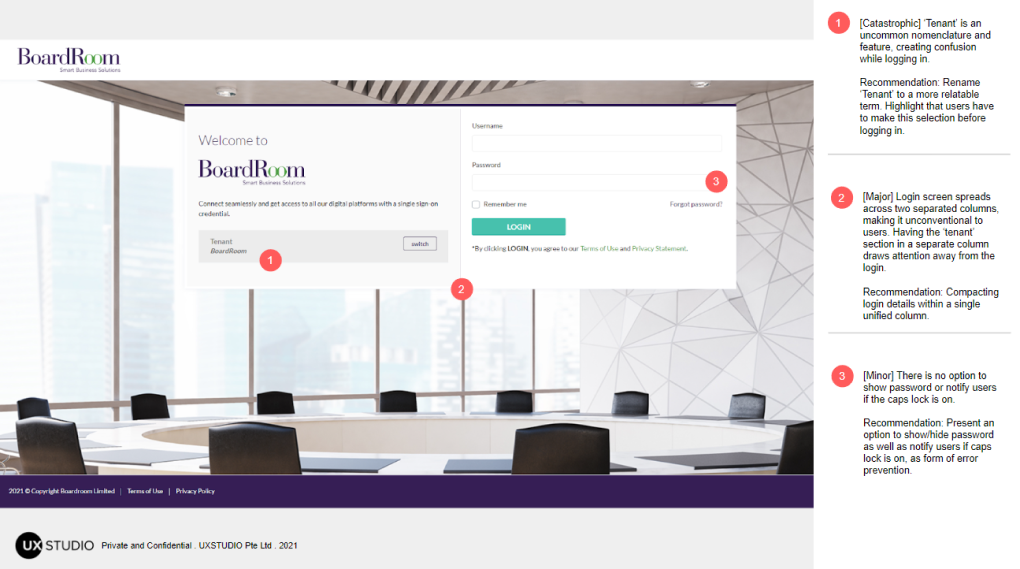
Heuristic evaluation of existing screen design
01 Illuminate: Heuristic Evaluation
Since there was already an existing product for the corporate secretarial services platform, we conducted a design audit to highlight both the positive and negative elements of the existing designs. Using Jakob Nielsen’s 10 Usability Heuristics, we identified areas for optimising the user experience in the revamped design. Some major UX problems were: issues in information architecture (IA), inconsistency of terminologies and designs, and lack of error prevention.
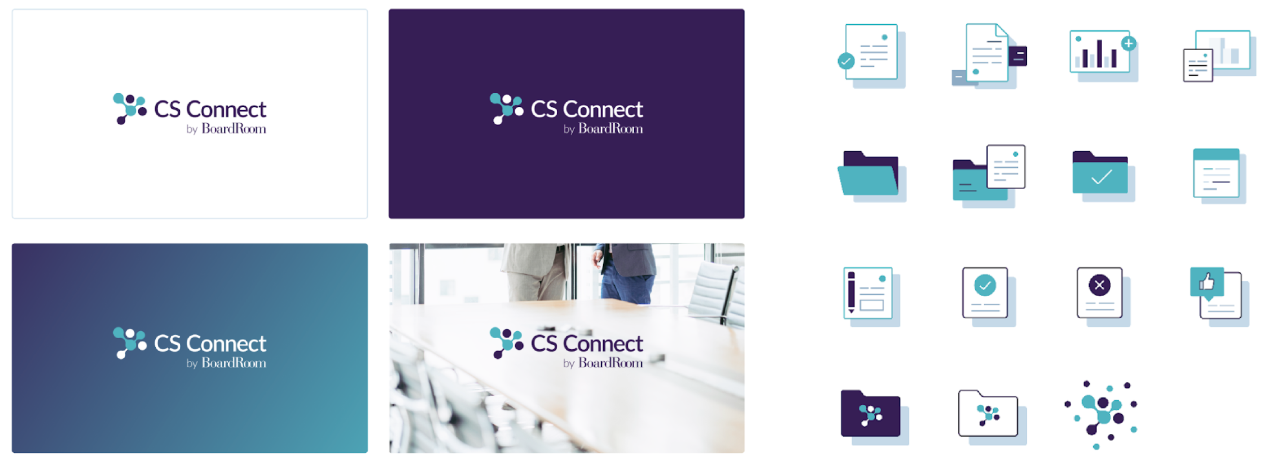
Rebranding design of CS Connect
02 Define: Product Brand Guide
This is an important design strategy phase as it builds the visual design direction of the product. We realised there were conflicting design languages in the platform and these would create confusion in the user’s experience. We did a rebranding of the corporate secretarial services platform to CS Connect, making it a sub-brand of BoardRoom. Using BoardRoom’s primary colours, we created a brand guide for CS Connect, consisting of a new logo and design component library.


Tree Testing task result example
03 Empathise: Information Architecure (IA)
Tackling the IA issue, we conducted 2 Card Sorting activities and a 3-tasks Tree Testing with a total of 11 participants with varying levels of experiences: Novice users, Business users and BoardRoom users.
For Card Sorting, we wanted to figure out how the users organise topics into categories that made sense to them and how do they label these groups. For Tree Testing, we evaluated the proposed menu structure to see whether there’s a hierarchy for how the user performs certain tasks. These two types of testing allowed us to refine the IA and establish a user experience flow that is intuitive for the users.
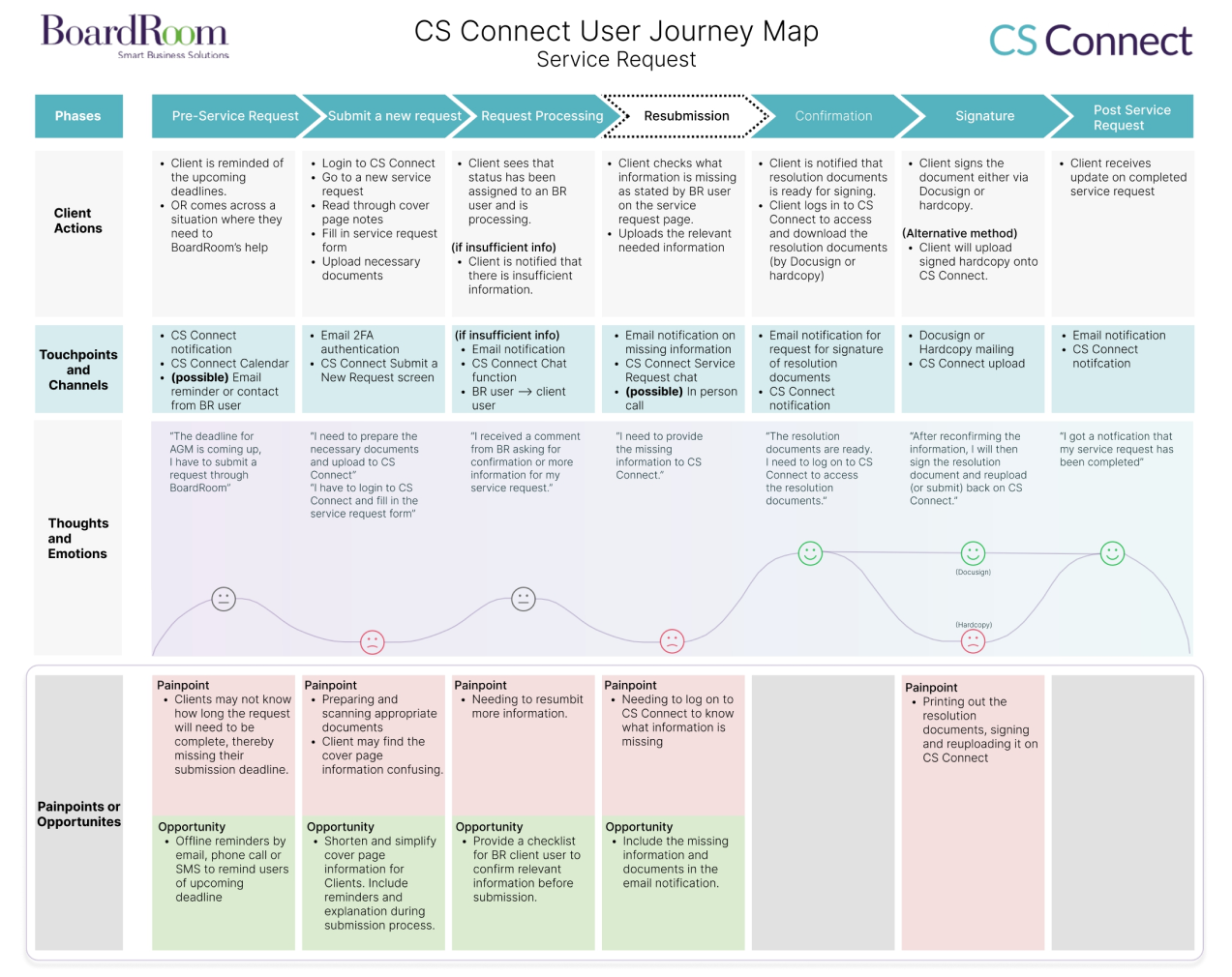
User Journey Map for CS Connect
04 Ideate: Participatory Design Workshop
We approach the ideation process with co-creating with BoardRoom users and stakeholders so as to better understand the needs of all involved. Wanting to prioritise and design a dashboard that the customers will use, we held a remote Participatory Design Workshop to find out what was the ideal dashboard design. There were a total of 10 participants, 6 BoardRoom users and 4 clients. The insights revealed different priorities between BoardRoom users and Client users. For example, BoardRoom users prioritise checking their to-do lists, and statues of new and existing service request tickets to follow up. On the other hand, Client users prefer easy access to their company profiles, registers and current service request updates.
But one thing was certain, there was a clear emphasis on accessibility and simplicity of the dashboard.


Evolution of existing UI screens (left two) to new redesign (right two)
Design Outcome
Through the Card Sorting and Tree Testing, we re-designed the IA and came up with with an end-to-end User Experience Flow depicting the routes users would take to navigate CS Connect: from the log-in to dashboard to other corporate secretarial services like payroll, accessing company profile and service request.
With the new brand guide, we redesigned the UI screens of CS Connect to give an airy and delightful experience. Previously, the harsh purple colour made the screens have very high contrast making it very tiring on the eyes. The newer design uses teal as the primary colour, giving it a more clean and professional look.
We handed the final designs and design library to CS Connect who has their own internal development team to further develop the platform.

A clean and professional look for CS Connect
Customer Review
“We had a wonderful experience working with UXStudio to design an user interface and user journey for a client portal tailored to meet the needs of our users. We were very happy with the high quality of work produced by their team of talented and professional designers. I would recommend them to anyone looking to create great user experience for their digital products.”
Vincent Goh, Regional Head of Applications & Engineering, BoardRoom Limited
Partner with UXStudio
Have an idea in mind? Or questions? Let’s start a conversation and explore new business growth opportunities together.